Randomness should be found here. If it is not, a full refund shall be provided at the end of the tour. This blog was started was for a Graphic Design class. It will be used for other randomness as well, fear not.
Thursday, November 15, 2012
Typography: The Neglected Child of the Design Family
I really love this poster for two reasons. First, it looks awesome. Second, it is so very true. Typography is the nearly forgotten element in mainstream design appreciation. Everyone notices graphics and colors, but not typography. I mean let's face it. If everyone appreciated good typography, Comic Sans would not be in use anymore. However, the fact that type is unnoticed is not necessarily a bad thing. I've said it before, and I will continue to say it, because I think it is true. Good typography is unnoticeable. It's blends in perfectly with a design. Type that calls undue attention to itself is type that is working against the design. It's our job, as designers, to make the type invisible...but let's appreciate it anyway. Type has feelings, too, you know.
Thursday, November 8, 2012
"United States, Canada, Mexico, Panama, Haiti, Jamaica, Peru..."
First of all, those who can identify the reference made in the blog title win 1000 internet points. Just wanted to lay that out there. As for this piece, I absolutely love it. Again, it is a wonderful example of how our brain fill in missing bits of type and how clever typography can convey a message with very minimal effort. I would personally love this on a wall. Not as framed art, mind, but the full wall. To me, it's just that good.
Thursday, November 1, 2012
E Pluribus Unum
Created by Louise Fili Ltd, this poster is an extremely detailed blend of graphics and typography. Over 8400 tiles were digitally manipulated to create this mosaic subway poster for the School of Visual Arts. It's a marvelous example of little details that make the design what it is. If you have the time, it never hurts to sweat the details.
Thursday, October 25, 2012
[untranslatable]
So, my mom actually pointed this business' logo out to me, and I have to say...it is not very well designed. She said she had trouble reading it as she was driving by, and I figured out why she did. You see, normally when you read, your brain is not actually translating the individual letters in a word into sounds. Your brain is actually recognizing the word and linking it to the sound and meaning you remember. This is why when we come to word we don't recognize, we slow down and sound it out. Our brain is learning the new word. The typography on this logo looks very nice, but it is not very readable. The lower-case letters make it a single entity, and since it doesn't register as a word we know, it is difficult to read. Especially driving by on the highway. A lesson to learn. Just because it looks nice, doesn't mean it works.
Thursday, October 11, 2012
"I'm the font that Gotham deserves..."
These superhero typographic posters were created by Matthew Olin, a Minnesota-based designer, for his MFA Thesis exhibition. I'm a comic nerd, so this appeals to me on a number of levels, but it's also very fascinating in a typographical sense. Each poster is of a style of font (serif, sans-serif, etc.), and each style has been given a set of "personality traits." These traits were then matched to a comic book hero, which is created using that style of font. It's an amazingly in-depth body of work, as he had to study each style and discover these traits that make them what they are. Bravo, good sir. Bravo.
Thursday, September 27, 2012
*clever and witty title*
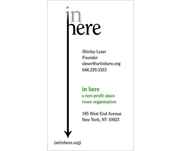
As our current assignment is designing a wordmark, I thought I would post on that. In Here is a traveling art gallery working within themes and space, and raising money for important causes. Their goal is to gain exposure to visual artists, curators, and collaborators, while temporarily revitalizing vacant locations and recycling functional space in a non-destructive way. As you can see, the logo is applicable in a variety of uses and forms. It is a simple design, yet works well at communicating to the viewer.
Wednesday, September 26, 2012
Robin Hood: Man in Tux
So! Since our current assignment is mainly centered around a logo, I figured that I would post an award winning logo this week and talk about it in a very professional way. This is not going to happen. I'm going to droll all over this logo and basically geek out on it. I LOVE THIS LOGO! It was made for a Nottingham, England-based jazz band. The logo references Nottingham's legendary bowman, Robin Hood, while also referencing the jazz aspect. I love how simple and brilliant this is! Robin Hood has been a favorite legend of mine ever since I was very very little, and this is just so amazing! Ok...I think I'm done.
*squeeeeeeeeeeeeeeeeeeeeeeeeeeeeeeeeeeeeeeeeeeeeeeeeee!*
Subscribe to:
Posts (Atom)