Randomness should be found here. If it is not, a full refund shall be provided at the end of the tour. This blog was started was for a Graphic Design class. It will be used for other randomness as well, fear not.
Showing posts with label Typography. Show all posts
Thursday, April 18, 2013
GDS172 HW13: A Visible Grid
Since part of the weeks reading dealt with grids, I thought this would be an appropriate example of graphic design to blog about. The type is make up of eight pieces of two-tone paper that are all the same size, but folded to make up the letters. The white space contains a visible grid that the letters follow. The visible grid works really well with folded look, bringing to mind origami tutorials and the like. Overall, very well done.
Thursday, April 11, 2013
GDS 172 HW12: Beard Fonts
So...this is a thing. A poster that assigns beard styles to a corresponding font. I need this on my wall. Anyway, while there is variation from face to face, the same basic shape is repeated throughout the piece, creating a rhythm. It's not a very exciting rhythm...rather like one person doing a slow and steady clap, but it is a rhythm nonetheless.
Thursday, March 28, 2013
GDS 172: Design From the North
This Winnipeg Pecha Kucha event poster was designed by a very talented Canadian named Jeope Wolfe. I feel that this is a very well done design and well unified design. The unity is achieved through color and the letterpress theme. Space is well utilized to allow for a design that takes up a lot of space, yet is still very simple.
Saturday, February 2, 2013
GDS 172: Funky fresh!
I don't know if this typography poster necessarily has a voice, but it most certainly has a sound and an attitude. I can't look at this poster without hearing this weird mashup of the 70s, 80s, and 90s sort of funky music in my head. And that is the exact attitude as well. Funky. This is a funky fresh poster. You want to dance to it because it's almost playing the music for you.
Thursday, January 24, 2013
GDS 172: Aural Sophistication
I absolutely love how effective the typography is in this ad! The tagline for this Panasonic DVD Theater system is: "The sound of movies has never been so sophisticated." This is expressed through the illuminated styling of the letter-forms. There is a sub-message carried by the typography as well. Not only is the sound sophisticated, but it is also highly detailed. While I don't know if the system lived up to this lofty ideal of detail and sophistication, I do see this as a highly effective use of typography. It enhances the message by making us wonder what sophisticated sound...well, sounds like, and makes us curious as to how this system could be different from others, which is exactly what the advertisers wanted.
Thursday, November 15, 2012
Typography: The Neglected Child of the Design Family
I really love this poster for two reasons. First, it looks awesome. Second, it is so very true. Typography is the nearly forgotten element in mainstream design appreciation. Everyone notices graphics and colors, but not typography. I mean let's face it. If everyone appreciated good typography, Comic Sans would not be in use anymore. However, the fact that type is unnoticed is not necessarily a bad thing. I've said it before, and I will continue to say it, because I think it is true. Good typography is unnoticeable. It's blends in perfectly with a design. Type that calls undue attention to itself is type that is working against the design. It's our job, as designers, to make the type invisible...but let's appreciate it anyway. Type has feelings, too, you know.
Thursday, November 8, 2012
"United States, Canada, Mexico, Panama, Haiti, Jamaica, Peru..."
First of all, those who can identify the reference made in the blog title win 1000 internet points. Just wanted to lay that out there. As for this piece, I absolutely love it. Again, it is a wonderful example of how our brain fill in missing bits of type and how clever typography can convey a message with very minimal effort. I would personally love this on a wall. Not as framed art, mind, but the full wall. To me, it's just that good.
Thursday, November 1, 2012
E Pluribus Unum
Created by Louise Fili Ltd, this poster is an extremely detailed blend of graphics and typography. Over 8400 tiles were digitally manipulated to create this mosaic subway poster for the School of Visual Arts. It's a marvelous example of little details that make the design what it is. If you have the time, it never hurts to sweat the details.
Thursday, October 25, 2012
[untranslatable]
So, my mom actually pointed this business' logo out to me, and I have to say...it is not very well designed. She said she had trouble reading it as she was driving by, and I figured out why she did. You see, normally when you read, your brain is not actually translating the individual letters in a word into sounds. Your brain is actually recognizing the word and linking it to the sound and meaning you remember. This is why when we come to word we don't recognize, we slow down and sound it out. Our brain is learning the new word. The typography on this logo looks very nice, but it is not very readable. The lower-case letters make it a single entity, and since it doesn't register as a word we know, it is difficult to read. Especially driving by on the highway. A lesson to learn. Just because it looks nice, doesn't mean it works.
Thursday, October 11, 2012
"I'm the font that Gotham deserves..."
These superhero typographic posters were created by Matthew Olin, a Minnesota-based designer, for his MFA Thesis exhibition. I'm a comic nerd, so this appeals to me on a number of levels, but it's also very fascinating in a typographical sense. Each poster is of a style of font (serif, sans-serif, etc.), and each style has been given a set of "personality traits." These traits were then matched to a comic book hero, which is created using that style of font. It's an amazingly in-depth body of work, as he had to study each style and discover these traits that make them what they are. Bravo, good sir. Bravo.
Thursday, September 27, 2012
*clever and witty title*
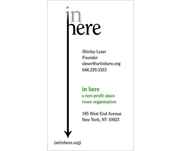
As our current assignment is designing a wordmark, I thought I would post on that. In Here is a traveling art gallery working within themes and space, and raising money for important causes. Their goal is to gain exposure to visual artists, curators, and collaborators, while temporarily revitalizing vacant locations and recycling functional space in a non-destructive way. As you can see, the logo is applicable in a variety of uses and forms. It is a simple design, yet works well at communicating to the viewer.
Thursday, September 20, 2012
Remember, Remember the Fifth of November...
Thursday, September 13, 2012
Blending In vs. Standing Out
This poster was created by English graphic designer Craig Ward and raises a particularly good point. The good typography is the typography you don't notice. In any design that incorporates type, it is the responsibility of the type to work alongside the design to better convey the message. Type that falls out of step with it's design partner is not only noticeable, but it detracts from the message that you are trying to deliver. This poster conveys this message wonderfully. It's a lesson for us all to learn.
Thursday, September 6, 2012
How Dry I Am
This book cover for a memoir of Augusten Burroughs was designed by Chip Kidd, and was actually explained a little during a recent talk of his given at the international TED conference. Kidd explained that, in the book, Burroughs recounts his time as a raging alcoholic, yet one in denial, and his journey out of that. Kidd went on to say how, to him, "this was always going to be a typographic solution, what [he called] the opposite of Type 101." He said that, unlike standard typographic practices, where the type matches the meaning or intent of the word, he wanted to do the complete opposite. As he put it, "I want this book to look like it's lying to you, desperately and hopelessly, the way an alcoholic would." His solution? Set up the type, print it off on an Epson printer with water-soluble ink, and throw a bucket of water at it. The resulting effect is very powerful and extremely effective. I say bravo, Mr. Kidd. Bravo.
Thursday, August 30, 2012
"There can be only one..."
ITC Highlander
ITC Highlander was designed by David
Farey and released in 1993. Highlander is a tribute to the Cooper
typeface, designed by early 20th century American typeface
designer and lettering artist Oswald Cooper. Farey, a long time fan
of Cooper, modeled this sans-serif typeface in the handlettering
style of the Cooper typeface. While Oswald Cooper never released a
sans-serif typeface, there were sans-serif letterforms used in a
number of lettering exercises that he produced, which Farey also drew
upon in his designing of ITC Highlander.
Subscribe to:
Posts (Atom)